Why hello! We haven’t had a major release since last October, but while you’ve been busy teaching, we’ve been hard at work behind the scenes. Eli’s stability has been much improved and we’ve been preparing new features that we think will make you flip.
Now that most spring courses have wrapped up, we’re releasing the first in a series of improvements that we think are going to make the Eli experience a lot better all around. Some are aesthetic improvements while others are features that should make it even easier to teach with Eli.
Improvement: Task Repository
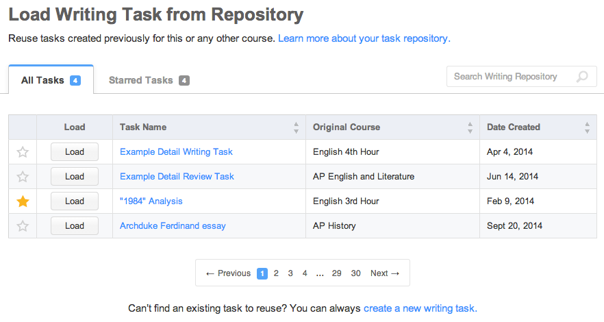
Eli has always had a “load task” feature that enabled teachers to reuse tasks they’d created before, saving them the hassle of having to re-key tasks they might use many times. You told us that you needed an easier way to find tasks you’ve created and use those tasks in another course, especially when you have a lot of them!
Today we’re releasing a major overhaul of the “load from repository” feature. Besides improved aesthetics, the new repository includes features that make it easier to work with your task library:
- sortable columns – easily sort your repository by task names, course title, or date created
- keyword search – find previous tasks based on keywords in either the task name or course title
- favorites – you can now “star” your favorite tasks, and they will appear in the “Starred” tab

If you haven’t used the task repository before, check out the full feature documentation for tips on how to use it.
Teachers may also find some surprises in their repositories soon as Eli’s curriculum team begins publishing lessons and guides that anybody can use. Stay tuned.
Improvement: Instructor Course Homepage
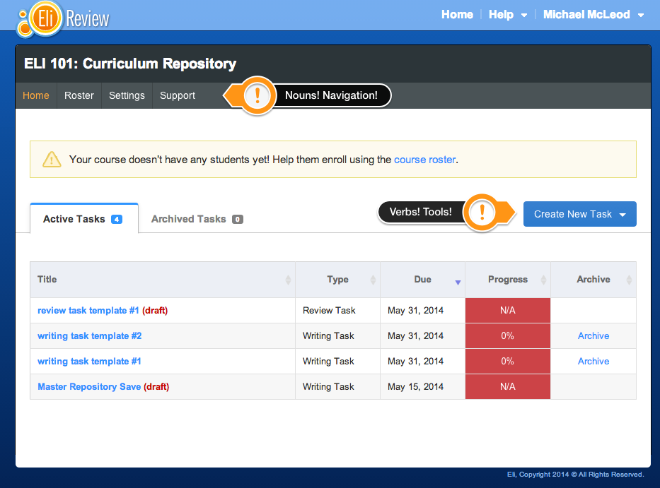
One of our goals as we improve Eli is to make its functionality more intuitive for new users. To that end, we’ve made the following upgrades to the instructor course homepage:
- improved navigation – all course navigation options are now grouped in a single bar under the course title.
- improved roster – we received a lot of feedback on this one and made the following adjustments:
- tabs with counts for “Active Students” vs “Inactive Students” – no more long scrolling to see a list of your inactive students
- “Add Students” option no longer hidden – course code now created automatically and displayed prominently
- “Create New Task” button – our old course navigation had nouns (roster, settings, etc) sitting next to verbs (create writing task, create review task, etc) – now, all of our verbs are grouped under a “Create New Task” button that sits next to the task list.

Similar improvements coming soon: improvements to account creation and course creation. Stay tuned.
Improvement: Contextual Comments
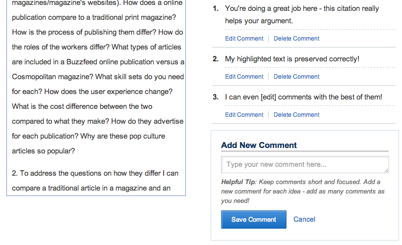
We are working hard to make Eli easier for students, too! One area where we’ve made a big improvement is contextual comments. This is an important part of reviewing. We have listened to your feedback in order to make the experience as simple and straightforward as possible. So here’s what we’ve done:
- Better buttons, calls to action – “Add a Comment” button improved, add a comment from a highlighted passage
- Improved writing space – guides students to producing better comments, expands as reviewer types (no more scrolls!)
- Highlights preserved, visible – hovering over a comment lights up the appropriate passage
- Better editing – expanding text box, easy display, single click to edit

We have big plans to completely overhaul the review experience, but for now, commenting should be much more intuitive and encourage reviewers to write more.
Improvements: Aesthetics and Performance
We couldn’t resist the opportunity to improve our looks and performance. We’re really excited about these changes:
- eliminated large background issues – our large background images were attractive but took too long to download
- flatter look, nicer colors – goodbye gradients, hello solid colors
- nicer typography – we picked a nicer-looking typeface and are making it consistent across the app
- better dropdown menus with better content – dropdowns have a new look and new, more useful options
Coming Soon: Data, Data, and More Data
We’re going to have more aesthetic and user experience improvements over the next few months, but our major push is going to involve providing instructors with data exports and visualizations for student performance data. This is where Eli’s real strengths lie, and we think our instructors (and especially teacher researchers) are going to flip when they see what Eli can show them. Stay tuned!
As always, if you have requests or feedback, please contact us:
- Email: [email protected]
- Twitter: @elireview
- Facebook: http://facebook.com/elireview

