We love your feedback. Whether you’ve emailed us asking for a feature, or tweeted to us for advice, every interaction gives us valuable ideas about how we can improve Eli to better support your work.
Today, we’re releasing updates to two major features. These updates address some of your most frequent requests, and your feedback and ideas on these features have helped us radically change Eli for the better.
Improved Course Homepages
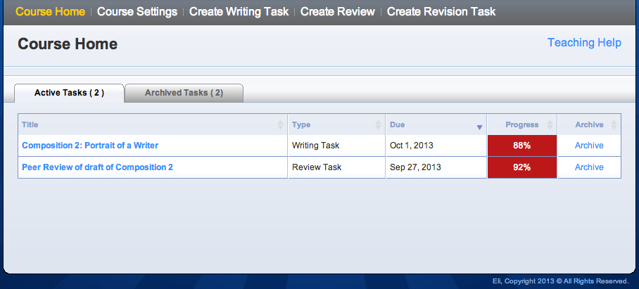
The first thing any user sees when they start a new course is the course homepage. Today, both the instructor and student homepages get a substantial overhaul.

Specifically, we’ve made the following changes:
- Simpler tabs: instead of tabs for each type of archived task (displayed at the bottom of the screen for some reason), there are now only two tabs: “Active Tasks” and “Archived Tasks.” So much easier.
- Better archiving: there are now only two states for tasks: active and archived. Instead of Eli deciding when to archive your tasks, which it used to do on its own, tasks will stay on your “active” list until you click the “Archive” link. They’ll still be accessible under the “Archive Tasks” tab, but you now have control over what shows up on your dashboard and when you want to hide it. If you archive something you want to bring back, simply use the “Restore” option.
- Better status indicators: Eli will now reflect the correct status of tasks for students (“Complete” vs “Incomplete”) and will show reliable and consistent progress displays for instructors.
- Easier sorting: all of the columns in the task list are now sortable. Just click the header of any column to sort according to name, type, due date, or completion progress.
We also improved the appearance of the course homepage when there are no active tasks so that it’s even easier to get up and running when you first start a course.
A Shiny New WYSIWYG
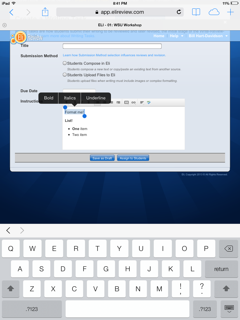
For lots of reasons we won’t get into, the text editor we’d been using for a while (also called a WYSIWYG editor) wasn’t great. It was functional for most users, but some folks had serious issues making it work correctly. Now, we’ve replaced that troubled editor with a much better tool.

This new editor is a big improvement, for lots of reasons:
- Better support for shortcut keys, making it easy to compose quickly (command-B for bold, for example).
- New features that allow for richer texts, including headers, tables, and links.
- Support for plugins, including a spellchecker, which some folks have been wanting for a long time.
- Easier to display in multiple views, so now you’ll see text editors lots of places:
- Student writing and revision tasks
- Instructor “create task” options
- Review comment and explanation options
- Revision plan options
Most importantly, though, the new WYSIWYG is web standards-compliant, meaning that it is supported by pretty much any web browser, including iOS devices like iPads. Eli has always almost completely worked on an iPad, but with this new text editor, it should be fully supported.

Thank you again for your feedback and support. Eli only gets better when we hear from you, so please keep sharing your successes, your difficulties, and your wishes.


