This post describes Bill Hart-Davidson’s first use of Eli’s new Course and Student-Level analytic reports. For more information about those features, see the full release notes.
For some time now, we’ve been working with teachers interested in seeing how Eli’s data displays can help them see students’ progress over the course of a semester or an academic year. For us, this meant turning individual data points into profiles of ALL the work students have done as writers, reviewers, and revisers.
We designed Eli from the start to be able to do this kind of data aggregation. Why? To give teachers and students the chance to reflect on and learn from their previous work. For teachers, being able to see how an individual student has progressed over time is important. Our friends teaching in K-12 schools and in colleges and universities all need to do this more and more these days: demonstrate, with evidence, how students’ outcomes – individually and as a larger group – have changed throughout the year.
Our new course and student analytics in Eli help teachers do all of these things! With the data provided, teachers can track student learning, monitor trends, and compile reports. We provide both the raw data for download as well as tables and trend graphs that can be exported for use in reports.
Reflecting On My Own Teaching
All of our new analytic reports are live and available today. And get this: they work for your archived courses as well as your active courses! For me, this is one of the more exciting things about the new features because I can go back and reflect on my own teaching. And I can adjust my practices to better meet students’ needs next time. Let’s take a look at one of my courses from last year and I’ll show you what I mean.
To get started, all I needed to do was click the new “Analytics” link in my course menu:

1. Insight: Need More Revision!
In the Spring, I taught a course called Introduction to Web Authoring. When I open my Analytics report, the first report I see is my Engagement Highlights – which is a measure of how much and what types of student participation was recorded in Eli – I see a couple of things that stand out to me. First, the assignment completion rate is pretty good. Second, I didn’t assign enough revision tasks:

The next time I teach this course, I want to try to get more revision planning into it. For a web authoring course, much of the revision happens online. And it happens so frequently that each individual revision is perhaps lost in the shuffle. But I want to use the revision planning assignments in Eli to do a better job of encouraging reflection on the part of students. After all, more reflection on revision goals has been shown in many studies to lead to better learning. [link to Fac Dev module]
2. Reviews Are Engaging! But Peers Need to Tell Reviewers When They are Helpful
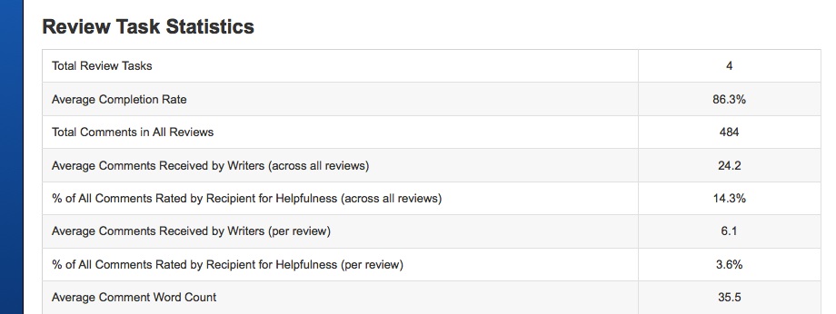
The engagement highlights got me thinking about review performance, so to learn more I selected the Engagement by Task Type report – for each kind of task, I can see more detail about the level of engagement for specific types of tasks over the whole semester. When I look at the report for review activity, for example, I am pretty happy with what I see there:

With four reviews, I see that writers got about 6 comments each and 24 total from their peers in addition to what I provided. Given that our writing tasks in the course were very short – consisting of small bits of html or css markup (for web authoring) and small chunks of web content, I am happy with this level of interaction.
I note, though, that less than 15% of students are using the star-ratings to indicate whether or not feedback from peers is helpful. I’ll be sure to be more clear about how to do that and why, next time I teach, I’ll do a better job explaining why rating feedback is valuable.
3. Peer Response Worked Well As an Overall Strategy in the Course
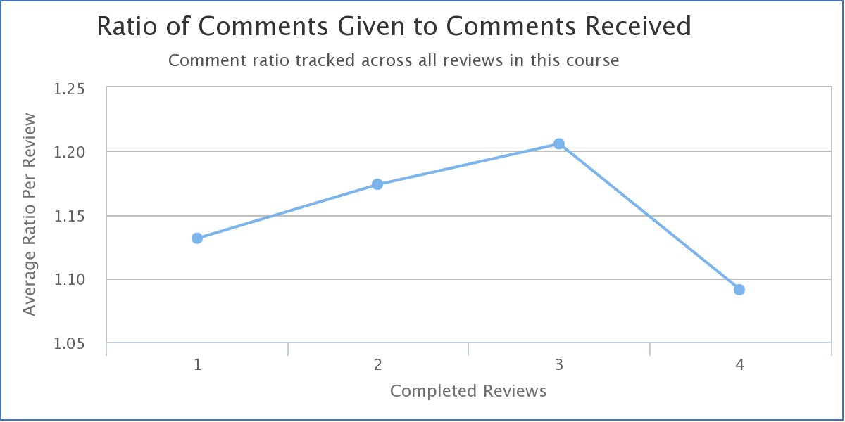
There are times when peer response groups don’t work so well in classrooms. If only a few people are giving comments, then lots of people aren’t getting the feedback they need. So I like to try and keep an eye on that to make sure nobody is left out. The new analytic report has three trend graph reports, and the graph for comments given/received makes that very easy for me to do!

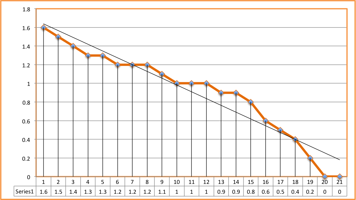
These results show that for every comment given in the four reviews completed, one was received, which is exactly what I hope to see. But this is an average. I also want to check to be sure that we don’t have big outliers who make the average look better than the reality for some students in the class. To do that, I can take a look at all of the students in the class by downloading the raw engagement data and loading it into my spreadhsheet of choice. All of the data I am writing about here can be downloaded this way for more in-depth analysis. Then I can graph the histogram to see where my high and low commenters fall (here’s a tutorial on how to create your own histogram).

I am happy to see that it still looks pretty good. I have a few folks who come in around the 1.5 comments given for every one received, which means they were giving more feedback than they were getting, but no big curvebusters. Oh, and the two with zeroes are my own accounts! All in all, it looks pretty balanced.
4. How Engaged Were My Best Performers?
As a teacher, it is not surprising to me when students who are not engaged in course activities do not end up doing well in a course. Missing class, not turning in assignments, not participating in peer response, those things almost always lead to poor performance on projects and a poor final grade.
But is the opposite true? Are our best performers also very engaged? In my class last Spring, they often were at least as engaged as average and had moments where they outperformed the top group in the course as well. This is something I might have suspected but now, with Eli course analytics that include detailed reports for each individual student, I can show it!

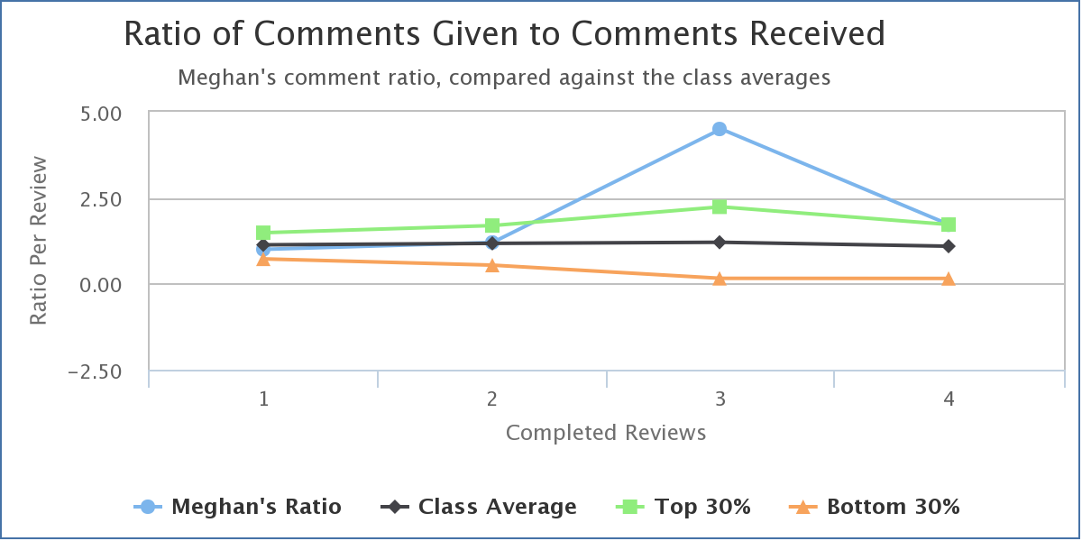
Here, for example, is the comments given/received ratio for one of the two students who earned the highest marks in the course.
You can see that Meghan tracks the class average for the first two reviews and performs better than the top 30% on the last two. This makes sense to me, because Meghan discovered during this class that she really loves building web sites. She had never done it before and she was intimidated at first by the technical aspects of the work. But once she tried it, she found she learned quickly and she really took off. As she did, she became one of the more knowledgeable peers in the course and her advice started to really help others.
More Feedback is Good For Teachers Too!
We are really looking forward to learning how teachers and students use the new information Eli makes available to track learning across a whole course. This feedback needn’t only be used after a course is over, either! For active courses, keeping track of trends helps teachers get the feedback they need to make changes. I use these data to know when to “lean in” and intervene when a student is struggling or when a particular assignment doesn’t seem to be working, and when to “lean out” and let students learn in one of the most effective ways we know: from one another.
Related Links
- Release notes: New Course and Student Analytic Features
- User Guide: Course-Level Analytics
- User Guide: Student-Level Analytics
- User Guide: Data Downloads

