The Student Analytics Report is meant to provide a portrait of an individual’s performance over the duration of a course. When a course is first created, the student report contains no data because there’s been no activity; the report will automatically expand as the student engages in rounds of the write-review-revise cycle.
The report is an aggregate of a student’s performance in individual reviews and charts trends over time. It is meant to give instructors insight into the individual and give benchmarks for comparisons against class averages. Its companion report, the Course Analytics Report, provides similar information but at course averages and not individuals.
Every student in a course has an analytics report. Student reports can be accessed one of two ways:
Like Course Analytics, student reports have five sections, as well as an additional navigation bar for quickly switching to the next or previous student in the roster (alphabetically):

The student report sections include the following:
When using any of the reports, keep in mind the following:
The Student Analytics Report was created not only to give instructors access to student data but to provide quick comparisons of student performance. To that end, Eli provides three points of comparison:
Top 30 / Bottom 30 is calculated differently based on the specific report, but wherever possible, it is calculated based on performance on a single metric – that is, the calculation is based on student performance on that metric.
The first section of the Student Analytics report is the Engagement Highlights display. It is designed to provide a quick overview of how the student’s engagement compares to the course averages. Its two tables demonstrate the following:

The data in the Feedback and Helpfulness table can be sorted by clicking any of the column headers. It can also be downloaded as a CSV file for more advanced searching and sorting. The Engagement Data report provides similar review data but is expanded upon significantly.
Top 30% / Bottom 30% : because this report displays many engagement data points, rather than looking at individual metrics, Eli sorts students into the top and bottom 30% based on these measures (in priority order):
Students are first sorted by helpfulness ratings, and when there are ties, the next measure is ratio, followed by completion rate, then by volume.
These reports consider individual engagement data metrics and graph their performance over time, revealing trends in student performance. The three engagement metrics currently available are:
Each graph is accompanied by a table containing all the raw data that went into plotting it as well as a toolbar enabling a number of different ways to download those materials.

Each point on a graph and each column in the data tables correspond to a single review completed by students in the course. If an instructor has assigned seven reviews, there will be seven points on each graph and seven columns in each table. Hovering the cursor over any data point or column header will reveal the name of that review and its relevant measure; clicking any data point on a chart will reveal the individual report for that review.

Each trend graph in the student report will have four lines plotted, corresponding with the student’s performance and the three comparison points (Top 30%, Average, Bottom 30%). Visibility of each line can be toggled by clicking the name of a line in the graph legend.

Switching between different graphs is quick and easy; above each graph is a dropdown labeled “Switch Trend Graphs” – just click this dropdown for easy access to each of the three reports.

This graph is meant to help an instructor see, in general, how much feedback is being exchanged during reviews.

Seeing comment volumes plotted in this chart can demonstrate a number of things:
The table below the volume chart lists the exact number of comments given by every reviewer who participated in a review as well as the class average for comparison.
This graph is meant to help instructors see, in general, how much feedback each reviewer has given in relation to how much they’ve received. The given/received ratio is calculated by looking at the number of contextual comments exchanged during reviews and, for the class average, the individual averages are aggregated into a single score.

The given/received ratio tells us the following:
Ideally, this graph would show a straight line – the closer the ratio is to 1, the more evenly distributed feedback is between writers and reviewers.
While this data is not scientific, it can give helpful insight into student behavior and suggest how that student might benefit from some direct instruction. Here are some ways to think about ratios:
Writers are given the option to rate each comment they receive on a scale of 1-5 stars. While it’s up to the individual instructor to coach students to rate their feedback and how to assess it (what a one-star comment looks like compared to a five-star comment), those ratings are compiled in this trend graph.
This chart can help provide answers to questions like:
Common trends: ratings graphs often slope downward over time. In early reviews, writers are eager to rate all of the feedback they receive very highly our of a desire to be friendly and collegial. Over time, as they get better at differentiating helpful from unhelpful feedback, ratings will often decline.
The table below the helpfulness chart lists the helpfulness averages for individual students on the comments they gave as part of a review.
This report expands on the data available both in the Highlights section of the student report but also the Average Student Profile data of the Course Analytics Report. Its purpose is to help instructors understand what the performance of a student looks like across all of their Eli reviews and to quickly be able to see how that student’s performance compares against the rest of the class.
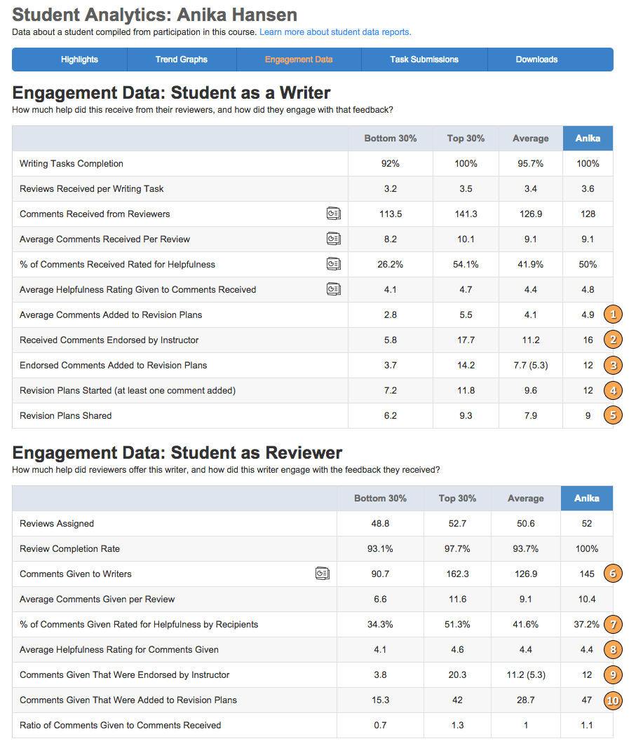
The data in these tables is intended to help instructors answer larger questions like “how much help did each student receive?” when compiling reports on student performance and engagement.
This report doesn’t provide any analytic data but does serve as a repository for all work done by the selected student. From here, instructors can see, overall, how much of the assigned work a student has completed and can get a detailed breakdown of student performance on each assigned task.
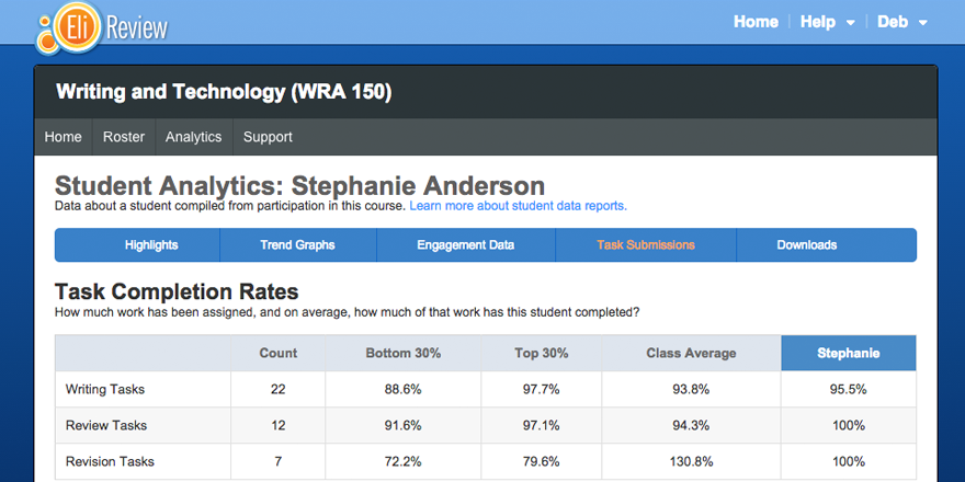
Clicking the name of any task in the “Task Submissions” table will load that student’s submission on the selected task.
These features give instructors the ability to download all of their raw student data. While most of this data is accessible through a browser, these tools allow instructors to take the uncooked student data and perform their own queries and sorts with it. This is particularly helpful for teacher researchers investigating their own practice or writing researchers studying student review behaviors.
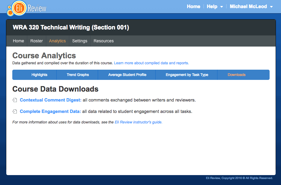
For a complete breakdown of the data available in these downloads, and about formats and methods for using that data, see the Data Download FAQ. You can also view samples of the data available via download:
There are a few factors to keep in mind about what data is included in these reports: