The end of summer and start of fall terms means that it’s time for us to unveil the big projects we’ve been working on all summer. We’ve already released a new data download and we gave our support website a new look, but we’ve saved our biggest changes for fall.
Supporting Global Peer Learning with Time & Timezone controls
We’ve been working with and learning from instructors across the globe for some time and we’ve excited for this major upgrade that will make their work easier.
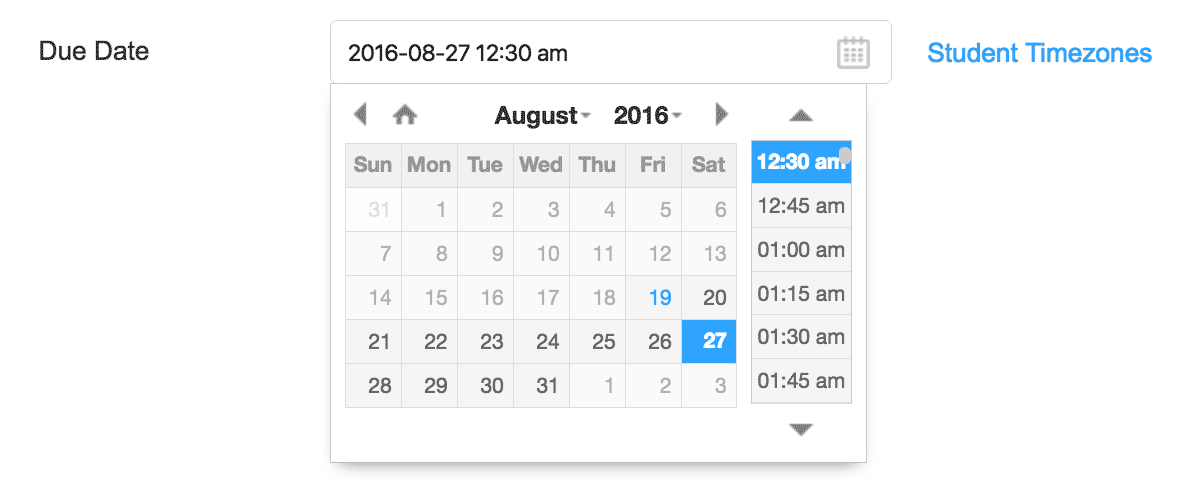
Eli Review now supports learners in every timezone on Earth. Instructors can specify time with their due dates, making it possible to display times consistently and reliably for students no matter where they live. Instructors, when creating tasks, specify not just the due date, but the time:

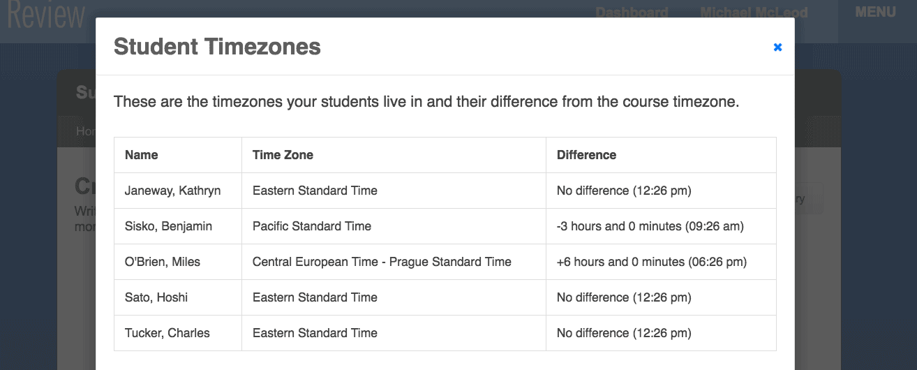
And instructors also have a convenient display of how their students are spread across time zones, helping them plan their due dates:

When students see the task, they see the due date in their local timezone along with a reminder of how much time they have left to complete the task:

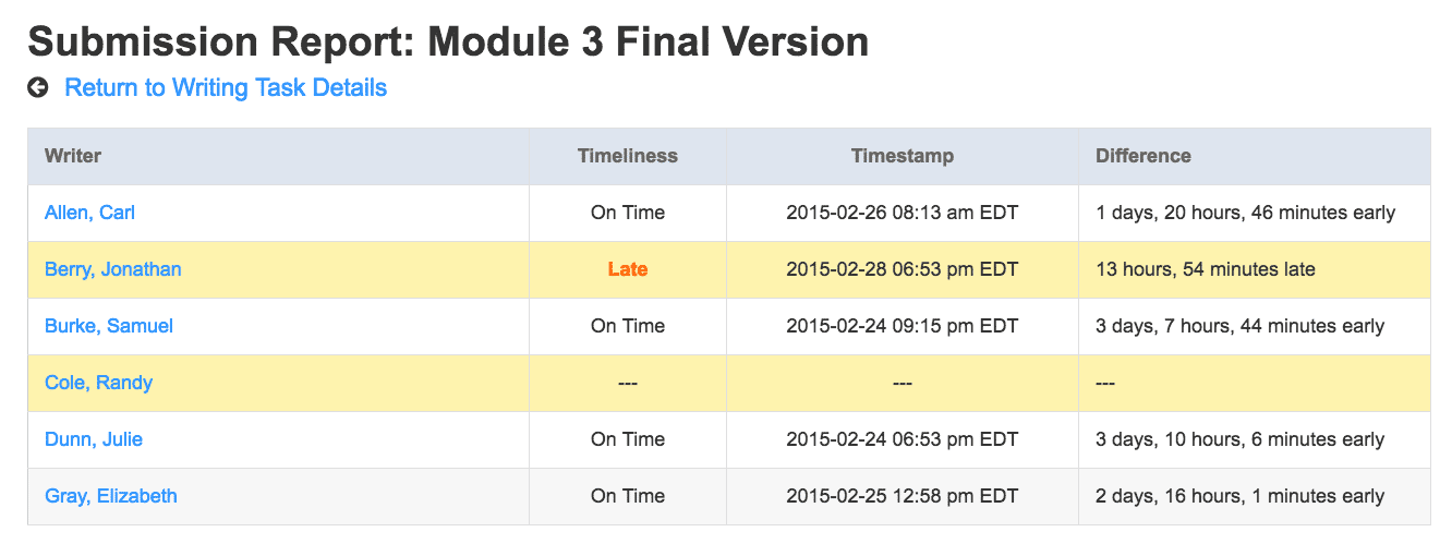
When instructors view student submissions, they have a clear indication of when that student submitted their work, including a precise indicator of how early or late that submission was.

You can check out writing, review, and revision tasks for detailed information about how time is displayed with each type of task, or get a high-level breakdown of how time works in Eli Review.
For a more in-depth look at time and timezones, see our user guide for How Time Works in Eli Review.
Better in-app navigation and learning resources
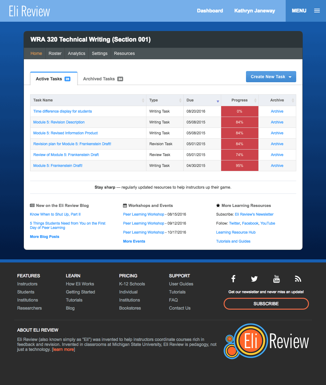
In addition to the big changes introduced in our new time management features, we’ve also introduced a whole new way to navigate Eli Review. The new method should be very familiar, but now, rather than dropdown menus in the upper navigation, clicking your name in the upper right will open a menu with far more options than account settings.
Through the new menu options you can access a wide variety of resources about the app and the pedagogy as well as more ways to find help when you need it.

The new footer on every page also replicates the look and feel of the marketing website, making navigation between the two far more consistent.
The Eli Review Team wishes, as always, to thank our community of instructors and students for their continued support and feedback. These improvements, especially the improved time features, have been coming together for years and we’ve had lots of input on how to add them thoughtfully. Thank you for helping us be a better company and be better writers.

